I first gave this talk at The Story 2013, a one-day conference about stories and storytelling organised by Matt Locke. I revisited it recently when Aaron Straup Cope and Seb Chan invited me to give a guest lecture on their ‘Museums and the Network’ course at Pratt Institute. I’m finally writing it up in response to a Twitter debate about participation and (or versus?) narrative in museums. But this post is long and David Cornish wrote an excellent summary for Wired.
Somewhat unusually, I came to the museum sector via Disney, having produced Virtual Magic Kingdom, a multiplayer online game based on – and linked to – the physical parks. Actions in the game unlocked experiences in the park, and vice versa. This was my introduction to producing distributed experiences that have both digital and physical dimensions – and I was hooked. In my museum work, I always look for opportunities to create digital experiences that play against the context of a museum’s physical site and unique collections.
Can an exhibition be a story?
There are great claims made for narrative in museums, whether that’s people’s stories bringing individual objects to life or storytelling in exhibitions. Museums have the potential to go further than books and film, to tell stories in both time and space. Museum Making: Narrative, architecture, exhibitions is a new volume of essays exploring just that promise:
“The narrative vehicle of the museum is particularly powerful because of its multi-dimensionality… The museum represents a fully embodied experience of objects and media in a three-dimensional space, unfolding in a potentially free-flowing temporal experience.”
“A means of creating empathetic links between the subjects and audiences of museum displays; and as a glue which plugs temporal, geographical and cultural gaps within the museum.”
But I think there are very big problems with storytelling in museums. Three issues stand out for me.
1. Non-linear experiences
Firstly, exhibitions are non-linear experiences, often because they’re installed in historic buildings and need to work around the quirks of the available space, but even more so because of how people choose to experience them. Even if exhibits could be presented sequentially, visitors would dip in and out, circle back. It’s much more of a dance.
And that’s a challenge to conventional storytelling, where first one thing happens and then another. The Disney parks are another narrative environment. Disneyland works over time to tell a story that unfolds in three-dimensional space, ‘from train to street to castle’. By contrast, they parks been carefully architected for the controlled delivery of a story.
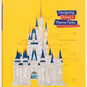
As Imagineer John Hench said, “You do not throw people into the fifth scene, where they cannot make sense of what is happening. You begin with the first scene and move through.” (Designing Disney’s Theme Parks: The architecture of reassurance) Each Disney ride was designed as if it was a film, with establishing shots and jump cuts:
“Vehicles swivel as they move forward, putting the passenger in the position of a moving camera that looks first in one direction and then another.”
A controlled flow between rides was also crucial to Walt Disney’s vision of a ‘well-ordered and harmonious park’. The castle is the park’s most prominent ‘wienie’, Disney’s own term for a focial point that attracts and disperses the crowd in a variety of directions.
Exhibition designers also talk about the use of ‘wienies’, or ‘attractors’, and often produce studies of freeze capacity, expected dwell times and precise visitor flows but this is almost never realised in visitor behaviour.
I’m not suggesting that museum exhibitions should function like Disney rides but the fact that they don’t makes storytelling more challenging.
2. Standing up to read
When I visit exhibitions I’m always struck by the behaviour of people in the space, and just how uncomfortable they look, particularly towards the end of a show – slouched, leaning, fatigued. Or just accelerating towards the exit.
Graphic elements are often the main carriers of an exhibition’s content: providing basic object data, delivering the main content messages, and moving the story along. But standing up isn’t a great way to read a book. Reading words on walls is uncomfortable and so will always be limited.
3. Academic text
The final barrier that I’ve observed is the text itself. Most exhibition text is written, or at least drafted, by curators, who are essentially academics with objects in their custody. In my, albeit limited, experience these curators have often already written their book or exhibition catalogue before they even consider the exhibition itself. Their imagined exhibition is therefore a blown-up version of their book.
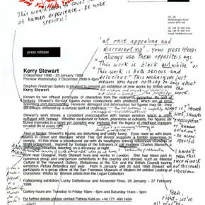
Recently there was a very funny, but almost entirely serious, paper by academics Alix Rule and David Levine. They analysed 13 years of e-flux press announcements and compared it to the British National Corpus.
They found a unique language, International Art English.
“The internationalized art world relies on a unique language… This language has everything to do with English, but it is emphatically not English.. But what really matters for this language—what ultimately makes it a language—is the pointed distance from English that it has always cultivated… How did we end up writing in a way that sounds like inexpertly translated French?”
“An artist’s work inevitably interrogates, questions, encodes, transforms, subverts, imbricates, displaces—though often it doesn’t do these things so much as it serves to, functions to, or seems to (or might seem to) do these things. IAE rebukes English for its lack of nouns: Visual becomes visuality, global becomes globality, potential becomes potentiality, experience becomes… experiencability.”
A story is best written by a practised storyteller but storytelling is a craft that is not often represented on exhibition teams.
Despite my pessimism, the two exhibitions I’ve had the freest hand in commissioning tried to be stories, at least one one level.
The Science of Spying at the Science Museum, London
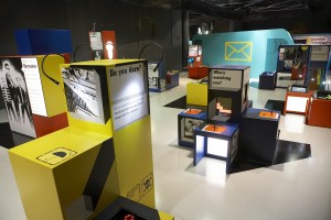
The Science of Spying was an issue-based exhibition for 8-12 year olds, which we designed with an emphasis on social and interactive experiences. The serious content messages of the exhibition were about both spying and surveillance but it was presented as a dystopian spy roleplay where children were trained up and then sent undercover in a corporation that produced ethically-questionable surveillance technologies.
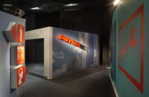
To infiltrate the corporation, OSTECK, the children needed to pass a brain or body scanner.
To exit, they had to evade a human gait recognition system.
High Arctic at the National Maritime Museum, London
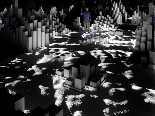
High Arctic was an interactive sound and light installation at the National Maritime Museum, created by United Visual Artists in response to a real-life expedition to the Arctic with Cape Farewell.
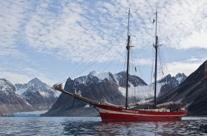
We invited United Visual Artists to ‘take our visitors on an enthralling and interactive journey to the Arctic, to convey the ocean’s scale, beauty and vulnerability in an era of global climate change.’ It was important that even this innovative installation was grounded in research so we established a collaboration with climate change charity Cape Farewell to host UVA on their 2010 expedition to the Svalbard archipelago.
On their return, UVA imagined a future without the frozen Arctic and created a monument to it, an ‘epic poem told in fragments’.
Assembling story teams
The storytelling team for High Arctic emerged naturally out of the Cape Farewell expedition to the Svalbard archipelago. Artist Matt Clark recruited his expedition fellows, poet Nick Drake and sound artist Max Eastley. This collaboration was essential to the success of the exhibition. Until Nick Drake was brought into the project, UVA had been struggling to interpret the museum’s requirement for ‘content messages’ in the installation. Those of you familiar with their work will know that they normally produce abstract and refined sound and light sculptures. We wanted both visitor participation and content-based learning outcomes.
We assembled the story team for The Science of Spying in a much more deliberate way. Again, it was provoked by a challenge within the project itself – how to tie 20 interactive exhibits into a coherent story. The story team included science researchers and a former MI6 agent, Harry Ferguson, to ensure everything we did was credible, and a commercial copyeditor, Chas Walton to ensure continuity, tone of voice and quality. We also consulted experimental theatre company, Shunt, to help ‘create sense of drama and induct visitor into a roleplay’, and science fiction writer, Cory Doctorow. As you can see here, our excellent graphic designers, Multistorey, collaborated with comic artists Laurence Campbell and Dylan Teague to bring narrative into the exhibition graphics.
Illustrations by Laurence Campbell and Dominic Teague
We also had a ‘design fiction’ component to the exhibition to provoke children to think about the social, cultural and political impact of the technology of spying on everyday life. We assembled a group of artists to design speculative objects, such as Dunne & Raby‘s dog wearing a surveillance muzzle:
Designed by Dunne & Raby
And Onkar Kular‘s surveillance-enabled toys for children, Hari & Parker:
Designed by Onkar Kular
So, what did story actually bring to each of these exhibitions?
In High Arctic, the story created atmosphere and invited visitors to connect to the installation – and issues – on an emotional level. This was particularly important for this exhibition given a prevailing mood of ‘climate change fatigue’. Here’s an extract from a review of High Arctic by Kat Austen for New Scientist:
I have read the statistics and reports. I’ve seen photographs of the crumbling glaciers. But never before have I truly felt the catastrophe of what we are losing. What made the difference? Yesterday, I walked into a basement in Greenwich, UK with a UV torch, and explored the Arctic.
There was a genuinely layered interpretative approach in High Arctic. Some visitors chose to simply use their torch or bodies to play in the light-reactive pools. This was certainly the approach of toddlers, an unexpected constituency for the exhibition. Others would sit on the weathered benches and listen to the entire poem play out. (See Irida Ntalla’s research for more analysis of how people experienced High Arctic.)
Photo by John Adrian
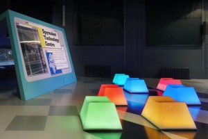
In The Science of Spying, the story was a provocation to ‘plus’ every exhibit. The expression ‘Plus it!’ was regularly used by Walt Disney to inspire his teams to make an idea even better, even when they thought they’d already nailed it. For example, we needed to introduce some seating in the second zone of the exhibition. The architects, Jump Studios, incorporated the seats in the overall design as scattered keys for an oversize computer. The interaction designers, AllofUs, made them into musical toys – if you sat or lay across them, you triggered sounds, light and vibrations. In a further plussing, the sounds played out a message in Morse code.
Science Fiction writer Cory Doctorow, a veteran of many collaborative writing projects, introduced the concept of a ‘shared world’. In a ‘shared world’, some fictional parameters are set by the writer(s) but everyone else is free to improvise around that. This ‘shared world’ was invaluable given the size and diversity of our team: over 50 creatives, including architects, graphic designers, interaction designers, modelmakers, AV producers, artists and build contractors.
For experimental theatre company Shunt, the most interesting thing about a museum (or theatre, or other cultural venue) is that it brings a group of people together in a shared public space. Shunt plays with that affordance in two ways: initiating the ‘audience’ into a role play, or light performance; and directing the audience’s attention back to the audience. All visitors to The Science of Spying exhibition passed through a disguised entrance and were provided with a fake ID card as an initiation into the roleplay. All visitors entering High Arctic were handed a torch, as a cue to explore.
So story, in my experience, is a great device within exhibition design. But are exhibitions the best way to tell a story? Not often. Because visitors don’t visit every exhibit you either need a lot of redundancy in the delivery of the story, or it needs to be an entirely optional layer, which effectively sidelines it. And I think that’s why for both The Science of Spying and High Arctic, books followed. Cory Doctorow went on to write the young adult novel Little Brother and Nick Drake published his work in a volume of poetry, The Farewell Glacier.
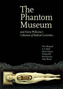
My favourite example of museum storytelling is actually The Wellcome Collection’s The Phantom Museum, an anthology of stories, true and imagined, inspired by objects from Henry Wellcome’s collection. Each story starts with one object.
(N.b. I read this before I had worked in museums so it’s possible that I’d respond to it differently now, with a more ‘professional’ eye.)
My conclusion – for the moment – is that it’s probably easiest to tell a story through a single display, rather than a large 750-1000sqm exhibition. The best example of this that I’ve seen was The Last Judgement in the Apocalypse exhibition at Tate: a sound and light show to accompany John Martin’s three great apocalyptic paintings. The presentation lasted ten minutes and took place every half hour. It had all of the embodied richness of a museum display, concentrated on a small set of objects, and played out within a discrete period of time.
“Cinemas aren’t good enough for cinema anymore, but museums are.” (Peter Greenaway)
Oh, and regardless of the size of the display, you need real storytellers on the team.

