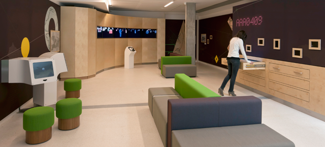
The Compass Lounge was a flexible space within the National Maritime Museum’s new Sammy Ofer Wing. Press accounts of the new Sammy Ofer wing noted the National Maritime Museum’s digital-led transformation: “Gives what was previously one of the less exciting options among London’s competing museums a much-needed digital shot in the arm.” (Creative Review) I co-authored a paper for Museums and the Web 2012, The Future of Digital Interpretation: Gallery Objects as Service Avatars, and the Horizon interactive received a silver MUSE award in the Interactive Kiosks category.
After 10 years of sustained digitisation, the National Maritime Museum developed a new website and lounge to showcase its vast collection. The purpose of both projects was to open up the museum’s collection and archive, and induct museum browsers into a research experience.
The digital interactives within the Compass Lounge allowed the Museum to display more objects. For example, the Horizon displayed over 4,000 images from five collections – ship models, oil paintings, flags, uniforms and coins/medals – grouped only by visual similarity.
This view transcended Museum classifications, allowing thousands of objects to be seen without imposed interpretation.
The plan chest was a physical embodiment of the Museum’s collections website. Wooden drawers were pulled out to reveal large touchscreens, each showing the most popular objects – how many times objects have been viewed, shared, added to a personal collection or tagged. In doing so, the plan chest showcased the collection in use. A linked LED installation displayed the relevant accession number, highlighting this unique key to all information and media about an object.
A small selection of historic photographs was also displayed in the lounge, each label inviting the public to contribute their knowledge to the Museum’s records. The display was refreshed twice a year through a process of co-curation with the public.
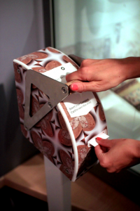
Every visitor to the Museum was given their own Compass Card to reveal the hidden connections between people and the objects in the collection, in the form of beautifully-packaged stories.
Visitors collected these stories by stamping their Compass Card at a selection of objects in the Museum’s permanent galleries.
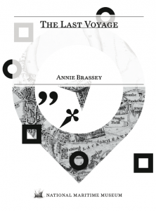
They were then sent a free, customised ebook. The book was a digitised copy of an item from the Caird Library, selected and designed in response to the objects that the visitor collected.
Finally, the visitor was invited to make an appointment to view the ‘real thing’ in the new archive reading room.
Credits
Design: Kin
Digital media: Dundee University, Gooii, Kin, Knowledge Integration, Liminal, Renderheads
Build contractor: 24 Design
Graphic production: BAF Graphics
My role? I led concept development for the project and oversaw its delivery by my department.


